CO2 to start with
A a consequence of a neverending fossil energy consumption (coal, oil, gas), CO2 emissions increase, and not only do they increase, but until recently they increased faster each year. The average annual increase, that what very high after the Second World War, started to diminish after the fisrt oil shock, but still these CO2 emissions go on rising, as it is easy to see below.
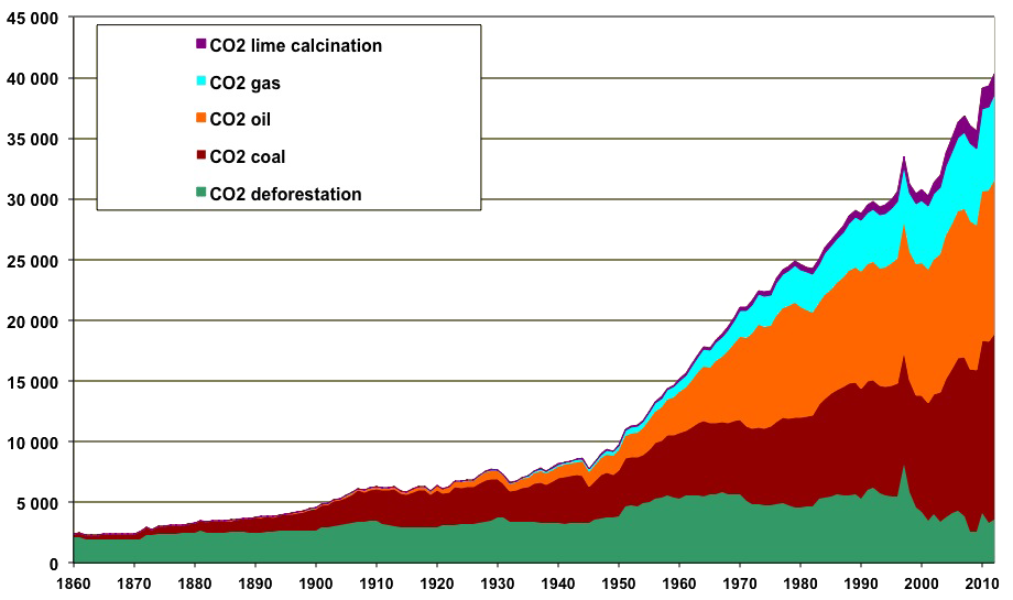
Evolution of CO2 emissions in the world since 1860, in million tons.
Source: author’s calculation from Shilling et al. 1977 and BP statistical Review 2013 for fossil fuels; CDIAC for lime calcination (a process used in cement manufacturing); Houghton, The Woods Hole Research Center for deforestation (through Global Carbon Budget 2013).
Incidentally there is an interesting remark that can be made out of the graph above: the only events that induced a – small – decrease of the emissions are “unpleasant” ones: wars, oil shocks, recessions (the latter has been particularly visible for the former USSR after 1990, when the fall of the Berlin Wall led to a recession of all the former communist countries). Of course, once of the causes of this rise is the rise of the population, but not only: there has also been a sharp rise of the emissions per capita.
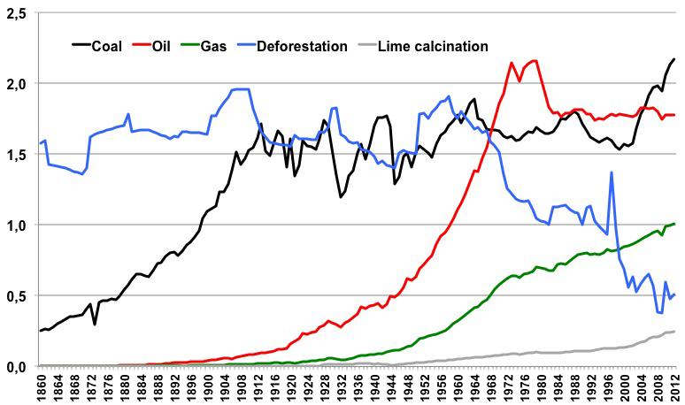
CO2 emissions per capita since 1860. One will notice that:
- Emissions per capita due to deforestation have globally been decreasing for a century, and this decrease has been particularly fast right after the Second World War. One might wonder if our forests have not been spared by the multiplication of tractors and fertilizers, that allowed an eightfold increase of yields. If so, what will happen when oil and gas become really constrained?
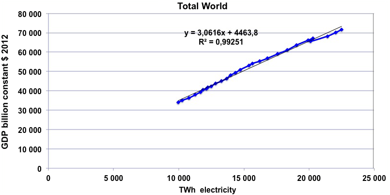
- Emissions per capita coming from coal have never stopped rising. The reason is alas simple: 2/3 of the world coal production is used to generate electricity, which increases along with the GDP (below, world GDP vs. world electricity generation for the period 1985 – 2012: a perfect line!).
- Emissions per capita due to oil are decreasing since 1979. It is another way to say that oil consumption per capita has probably passed its historical maximum, and will go on decreasing.
- At last, emissions per capita due to gas are rising fast, and seen insensible to economic shocks such as 1979. A possible explanation is that gas was mostly used for heating, which is more sensible to temperatures than to the GDP. Let’s recall that even though gas is natural, it is available in finite amounts, and burning it leads to CO2 emissions!
Source : same as above + World Bank for population
If we breakdown the CO2 emissions by country category as referred to in the Kyoto protocol, we get the below figure.
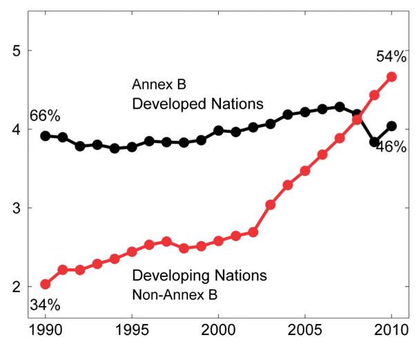
CO2 world emissions, in millions tons of carbon equivalent
Annex I designates all the countries that have committed themselves to a reduction of the greenhouse gases emissions under the terms of the Kyoto protocol; this category essentially comprises developped countries and countries “in transition” (Eastern Europe countries, mostly).
Annex II designates the countries that signed the Kyoto protocol but that did not commit to any reduction (essentially developping countries, including China and India).
Source : Global Carbon Budget 2012 ; Le Quéré et al.
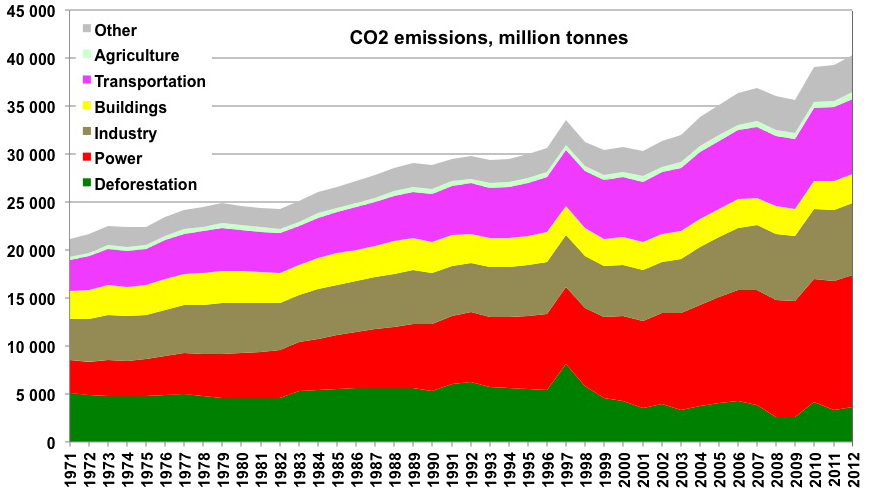
At last, we can look at the breakdown of CO2 emissions by nature of activity, that each use coal, oil, gas, not forgetting deforestation and lime calcination.

CO2 emissions by activity since 1971
Power comes first, and is the most rapidly growing source.
Sources : BP statistical Review 2013, CDIAC, the Carbon Budget, Woods Hole Research Center (Houghton et al.).
Other gases
But it is essential to remind that CO2 coming from the use of fossil fuels accounts for only half of the problem. A large fraction of the additional greenhouse effect comes from other gases:
- CO2 linked to deforestation, often referred to as coming from “land use and land use change”, because practically the land use change that leads to significant CO2 emissions is deforestation: most of the wood is cut then burnt (logging represents a small part of the forest decrease, even though it often creates paths that allow the cutting of the rest of the wood by locals peasants seeking arable land), what generates CO2 emissions, and then the soil frees adds some CO2 emissions when it is`plowed (plowing exposes the humus to the air and lead to accelerated oxydation of the soil carbon),
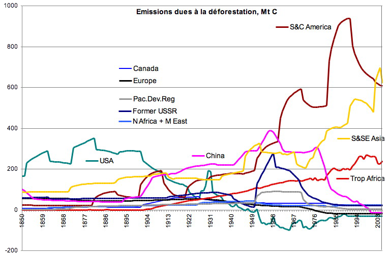
CO2 emissions due to deforestation since 1850, in million tonnes of carbon per year.
One will note that :
- When deforestation was the first cause of greenhouse gases emissions (late 19th century), it was the US that contributed the most! Now the US forest is expanding, and therefore the US has a net sink (as Europe)
- Southern America, long the first contributor, is now caught up by South East Asia,
- China has stopped deforesting,
- Tropical Africa is the third large contributor.
Source : Houghton, The Woods Hole Research Center
Adding emissions from fossil fuels and from deforestation gives the following picture.
Co2 emission by zone, in million tons, adding deforestation and fossil fuels.
Source : BP Statistical Review et Houghton, The Woods Hole Research Center
- Methane and nitrous protoxyde, that mostly come from agricultural practices (these emissions are growing, partly because of the demographic growth, and partly because of the increase of products of animal origin in the diet, what requires more land and/or more fertilizers and pesticides.
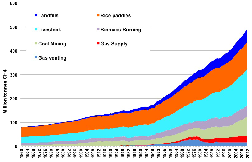
World methane emissions by source since 1860, in million tonnes
Livestock = ruminants, gas flaring = burning of the gas on oil fields, gas supply = leaks during gas extraction and distribution, coal mining = venting of mines, and biomass burning = incomplete combustion of biomass.
Source: Annual Estimates of Global Anthropogenic Methane Emissions: 1860-1994, David I. Stern* and Robert K. Kaufmann + extrapolation by myself after 1994.
- halocarbons, that are notably used in cold devices (in rapid growth), or in the semi-conductor industry (in rapid growth also)
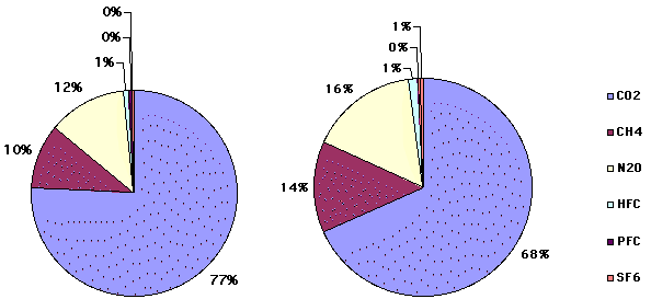
We can now compare the emissions depending on the gas, which is the purpose of the graph below.
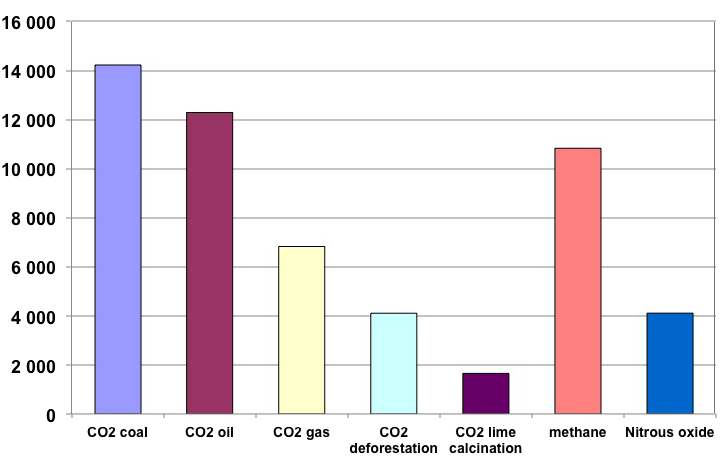
Breakdown of world greenhouse gas emissions in 2010 by gas (except ozone), in million tonnes CO2 equivalent.
Author’s estimate from various sources
And if we allocate the emissions to the contributing activities, here is the global picture since 1971 :
Emissions by sector since 1971, F gases excepted, all greenhouse gases taken into account
Sources : BP statistical Review 2013 for fossil fuels; IEA for the breakdown of fossil fuel by sector; CDIAC fo lime calcination; Houghton, The Woods Hole Research Center for deforestation; source above for methane, and calculations and extrapolations by the author.
Looking at the above graph, we might think that “industries” account for most of the emissions: the own the power plants, the industries, and run part of the transport. But we might also look at what we get if the emissions associated to refining and electricity production are allocated to the sectors that use fuels or electricity.
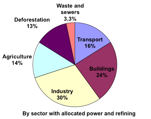
Looking at the above graph, we might think that “industries” account for most of the emissions: the own the power plants, the industries, and run part of the transport. But we might also look at what we get if the emissions associated to refining and electricity production are allocated to the sectors that use fuels or electricity.
Surprise! Buildings come before transports. Individuals are responsible for most of the energy use in buildings, as well as half of transportation, and of course all the goods are bought by someone… Industry is 10 times larger than waste management: recycling is a good idea, but not buying a better one if we want ti be sustainable!
Source: BP statistical Review for fossil fuels; IPCC AR4 WG 3 (2007) for lime calcination; Houghton, The Woods Hole Research Center for deforestation
Are all countries equal ?
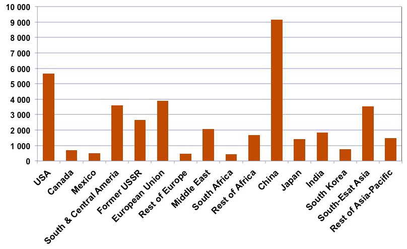
How do contries compare for this problem ? We can of course breakdown the emissions by country, what immediately allows to see that a couple of major countries account for a large fraction of the world emissions.
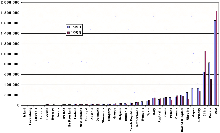
Greenhouse gas emissions, without sinks, in thousand tonnes carbon equivalent for most Annex I countries plus China.
From United Nations Framework Convention on Climate Change – UNFCCC (for China emissions concern just CO2 – figures coming from the french Ministère de l’Industrie). NB: emissions coming from international travel of goods or people are not affected (they do not end in a national total).
It can be noticed that all Eastern Europe countries have notably diminished their emissions between 1990 and 1998, thanks to….the recession they experienced. Are economic growth and decrease of emissions compatible ?
But the ranking of the emissions per inhabitant is rather different, and in addition to something expected, which is that emissions are more or less proportionnal to economic development, this ranking reveals a surprising fact : among the G7 countries, emissions per capita vary from 1 to 3 between the most “virtuous” countries and those who are not.
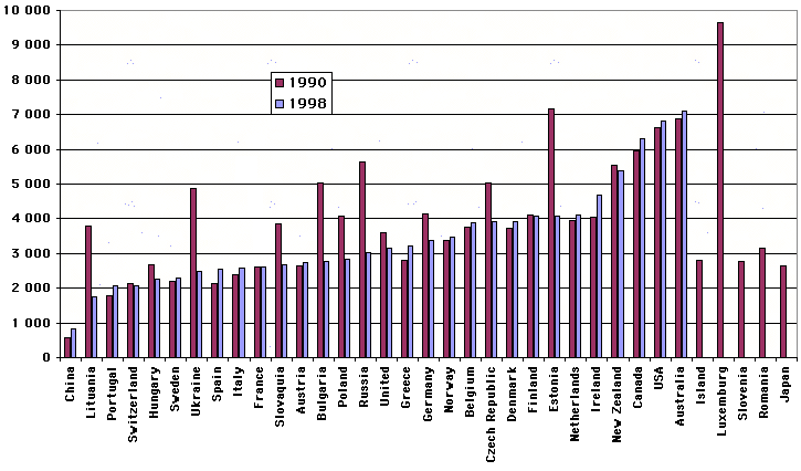
Greenhouse gas emissions per person and per year, in kg carbon equivalent, for annex I countries plus China (China: CO2 only), for 1990 and 1998 (ranked by 1998 level).
It can be noticed that among the countries that have an important GNP per inhabitant, the most “virtuous” are France, Sweeden and Switzerland, three countries that produce their electricity with “carbon free” means: nuclear and hydroeletricity. In the case of Switzerland the high proportion of services in the economy probably also plays a role. Emissions per inhabitant in China are close to one tenth of what they are in the US.
This figure also shows clearly the important decrease of the emissions per inhabitant of the former communist countries.
Source :United Nations Framework Convention on Climate Change (except China: french minitry on industry) – UNFCCC ; Institut National d’Etudes Démographiques – INED for populations ; divisions have been made by your humble servant.
The “big bad boys” regarding greenhouse gases are without any doubt the Americans: not only their country is the first emitter in the world, but they are also on the podium for the emissions per person, and the latter is still rising !
The “under-developped” countries are definitely lower emitters: in average, the CO2 emission per inhabitant (energy use only) is around 0,4 tonne carbon equivalent per year (that is one fifth of what a French “does”, and 7% of what an American “does”), but all non-Annex I countries (those who did not commit to any reduction of their emissions so far) are not that low !
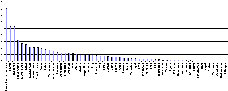
Net CO2 emissions per person and per year, in tonnes of carbon equivalent, for a large selection of non-Annex I countries (those who did not commit to emission reductions). To give a reference, A Swiss citizen emits 1,7 tec/pers./year, and USA citizen over 5, for this sole gas.
Note the modest emission per capita of India (0,3 in rough figures) and the very low emission per capita of major black african countries (Nigeria is the most populated african country, with over 120 million people). Note at last that Israel, South Korea and Singapore, not to mention oil producing countries, though having emissions per capita and/or developping status close to that of OECD countries, did not commit to any reduction.
Source : United Nations Framework Convention on Climate Change – UNFCCC.
And at last the breakdown by activity of greenhouse gases is very different from one country to another. It depends on the global economic wealth, the dominant electricity production mode(s), the eating habits…. In order to give an idea anyway, here is what it is for the whole planet and for the sole CO2 seul (as emissions are known with an 50% error margin for methane and nitrous protoxyde, a beautiful pie chart would not be easy to draw….).
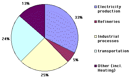
Breakdown by activity of the CO2 emissions in the world in 2012.
It can be noted that the first source is electricity production. It can then be easily understood that, given the reduction effort that it is necessary to achieve if we want to seriously adress the problem, the fight will be more easily won if we do not refuse the help of nuclear electricity.
Source : International Energy Agency
And what about France ?
Due to the fact that we produce almost all our electricity with “CO2 free” processes (nuclear accounts for 80%, and hydroelectricity for 15%), the breakdown in our country is not the same: for CO2 emissions it is transportation that comes first, with “buildings” coming second (use of fossil fuels for heating or sanitary hot water, but air conditionning, if it operates on electricity, is not included, because using electricity does not free any CO2, it’s producing it that possibly does).
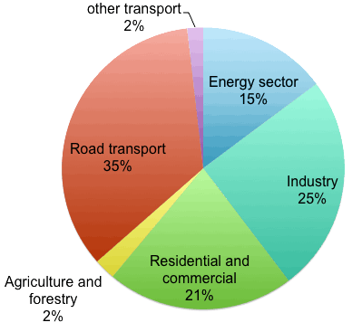
Breakdown by activity of the CO2 emissions in France in 2011. Sinks are not accounted for (this means that carbon sequestration resulting from forestry is not deducted from the emissions of the agricultural sector (that includes forestry).
The first source in France comes from transportation, with one third of the total, but it has stopped growing (see below).
If we charged the transportation sector with the emissions happening in the refineries to produce gas (that are in “energy sector” on the pie chart above), the emissions happening in the industry to manufacture the cars – and produce the necessary steel and plastics – and build the roads, and more generally the emissions produced by all activities that concur to movement (insurance, car dealers and garages, etc) the total for road transport would probably come closer to 40%. Nomenclature has its importance !
NB: international air transportation is not included (under the termes of the Kyoto Protocol international transportation by air or sea is not affected to national totals).
Source : CITEPA, 2012
In France the “energy sector” is composed for half of emissions coming from the coal and gas fired power plants that we also have (but in little quantities), and for the other half of emissions coming from refineries (refining oil consumes about 8% of the initial oil, the heating energy being often provided by oil coke). Incidentally it is interesting to note that “clean” fuels (no sulfur, for example) require an additional energy consumption in refineries to be produced, therefore generating more CO2 emissions.
If we take all the greenhouse gases into account, surprise! It’s the agriculture that comes first ! (chart below).
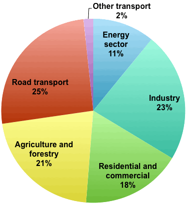
Breakdown by activity of the greenhouse gases emissions in France for 2011, all gases (except ozone) being taken into account. The sinks are not taken into account (I don’t know how to deduct them from the various activities !).
It is noticeable that the first source is still road transport, but agricultural activities are about equal to transport or industry. We can make the same remark as above for agriculture, though: if we gather all that is emitted to provide food (agriculture, but also transportation and processing of food, including the manufacturing of all the packaging that we will throw away later on) then eating probably accounts for a little third of all emissions.
NB: international air and sea transportation is not included
Source : CITEPA, 2012
Indeed, agriculture is the principal emitter of “non CO2” gases: 2/3 of methane – CH4 – and of nitrous protoxyde – N2O – come from agricultural activities, respectively from cattle raising and fertilizer use. These “minor” gases represent a little bit more or a littyle bit less than a quater of the emissions depending on the way to calculate (charts below).
Breakdown by gas of the french greenhouse gases emissions for 2001.
Left pie: without sinks.
Right pie: with sinks, therefore counting only the net CO2.
Source : CITEPA, 2002
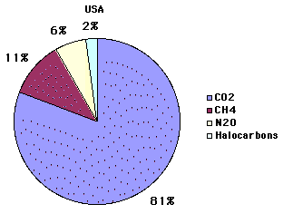
A very energy-intensive country, where CO2 massively dominates: USA
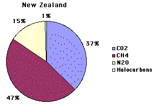
A country with a very important farming activity (grazing): New Zealand
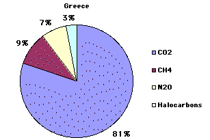
A not so intensive energy consumer but that uses a lot of coal for electricity: Greece
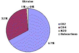
Another country with a proportionnally important farming activity: Ukraine
The respective proportions of CO2, methane and nitrous protoxyde may vary (a lot sometimes) depending on the country : those with an important share of agriculture in the activity generally have methane emissions proportionnally higher, while heavily industrialized countries that, in addition, use a lot of coal fired power plants have CO2 emissions even more dominant than in France.
In France, do all sectors evolve the same way ?
No, that’s not the case: respective evolutions are rather different depending on the activity/sector. This analysis, though restricted to France for the precise figures, is more or less valid in many other places.
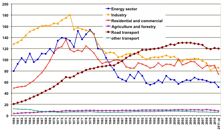
Breakdown by activity of the CO2 emissions in France since 1960, in millions tonnes of carbon equivalent. International air transport is not included.
Three epochs are visible on this graph:
- before the first oil shock (1974), all emissions are rapidely rising. The strong economic growth that went along with reconstruction in France after the Second World War went with an equally strong growth of the emissions, with a final phase obvious in 1973.
- after the first oil shock, the industrial sector starts to efficiently track down every Joule in excess, and besides converts some usages to electricity (replacing a fossil fuel by electricity, produced or not with a fossil fuel, displaces the emissions from “industry” to “energy sector”). All this leads to a continuous decrease of the emissions until the “counter-shock” (oil became very cheap in 1985).
- During the same period the growing share of nuclear energy, resulting from the program launched by the french government in 1974, allowed a fast decrease of the emissions of the energy sector. At last, households have also focused on energy savings in the buildings, with visible results.
- and at last the road transport gorws… until the world oil production becomes almost constant, and then the CO2 emissions begin to decrease, because the French oil supply does the same!
Source : CITEPA, 2012